Best Practices
Here are some best practices to consider when building your widgets. For further reading, please refer to the Developer’s Guide.
Table of contents
- Use ION APIs to communicate with the backend
- Focus on speed and performance
- Use IDS Enterprise component library
- Theme Support
- Translate your widgets
- Formulating widgetTitle and widgetDescription
- Design for all widget sizes
- Add widget screenshots
- Enable your widgets for Infor Go
- Build your widgets for the banner area
- Configure a Help URL
Use ION APIs to communicate with the backend
The widget should exclusively use ION APIs to communicate with the backend. For example when retrieving data, or creating / updating / deleting data.
Further reading
- Developer’s Guide (Chapter 10: ION API)
- Youtube playlist for ION and ION API Gateway
- ION API Admin guide
- ION API Github
Focus on speed and performance
The widget should be developed with focus on speed and performance. High performant APIs with short response times, minimizing the number of requests as well as data size and the number of items retrieved to a set of 10-15 items with a max limit of 100. (Purpose built APIs for charts as client side calculations on data sets does not deliver high performance)
Further reading
- Developer’s Guide (Chapter 10: ION API)
Use IDS Enterprise component library
When designing your widget, we strongly recommend using the IDS Enterprise Components for the UI.
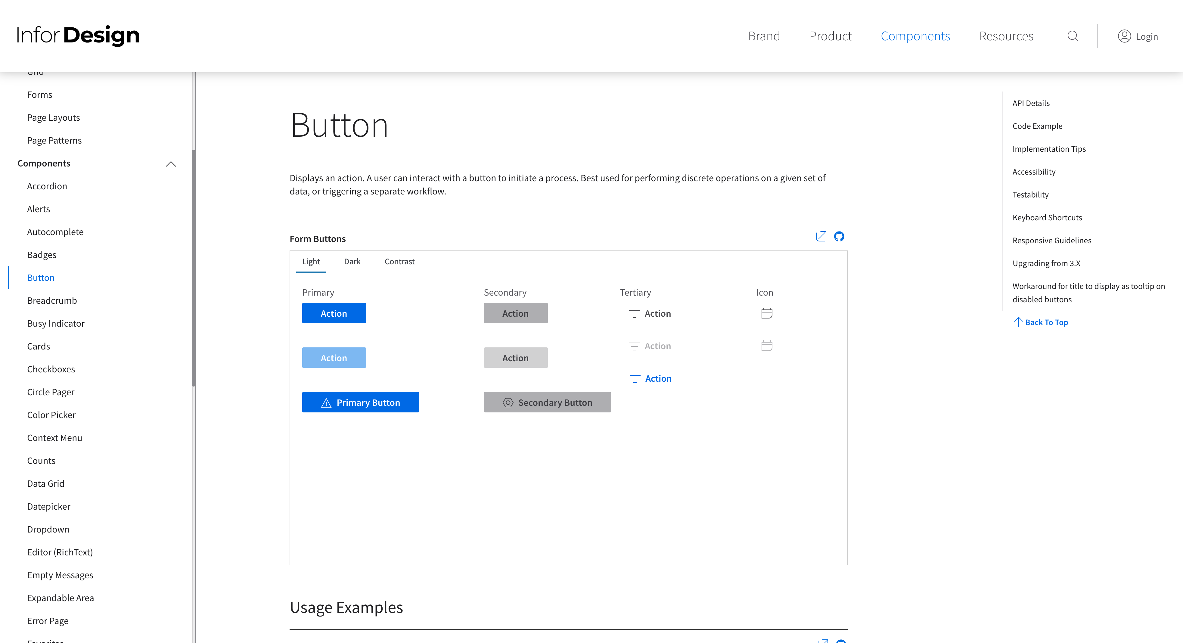
The IDS Enterprise Components is a framework-independent UI component library built in js and css that is pattern-focused, template-driven, touch-enabled, responsive, accessible, and themable.
Complex custom components should always be avoided. If custom styling or components has been used, they must follow the IDS guidelines for look & feel, theming, mobile and accessibility support.
Further reading
- Developer’s Guide (Chapter 2: Overview > Enterprise Components for Infor Design System)
- Infor Design System (IDS)
- IDS Enterprise Components
Theme Support
Widgets should support the three theme variants of the IDS Subtle Theme; Light, Dark and High Contrast.
The IDS Enterprise components automatically supports all theme variants.
If custom styling or components has been used, those must align with the IDS look & feel for each theme variant.
Further reading
- Developer’s Guide (Chapter 3: Widgets > Theme Support)
Translate your widgets
We recommend that you translate your widgets so that they support the same languages as supported by Infor OS. For a current list of supported languages, see Developer’s Guide.
Add translations using the localization property in the widget manifest.
Example
"localization": {
    "en-US": {
        "widgetTitle": "Announcements",
        "widgetDescription": "Displays the latest announcements that require your
        attention. You can use the widget options to control how long each
        announcement is displayed and to animate the content when the announcements
        are switched. A maximum of 15 announcements can be displayed in the widget.
        \r\n\r\nA user with the role HOMEPAGES-ContentAdministrator manages the
        priority, layout, content, schedule, and audience for each announcement in
        the Homepages administration pages."
    }
}
Further reading
- Developer’s Guide (Chapter 3: Widgets > Widget manifest > Optional manifest properties > Localization, Chapter 7: Localization)
Formulating widgetTitle and widgetDescription
It is important to follow certain guidelines of the IDS team and other limitations when writing a widget description or widget title.
widgetTitle
A widget title should be short, direct and give an idea of the widgets purpose.
Must not contain more than 40 character, this is even after translations so be wary if you reach close to 40 characters and plan to translate the title.
In most cases, do not add a prefix to the widget title such as the product names etc. This should instead be added in the widgets description.
widgetDescription
Do not write “This widget” or variants of it like “This app”.
Must not contain more than 1024 characters, note that even if a description can have 1024 characters, there is still a limit to how much text that can be displayed in the widget catalog thumbnail. (Widget details in catalog will always show full description).
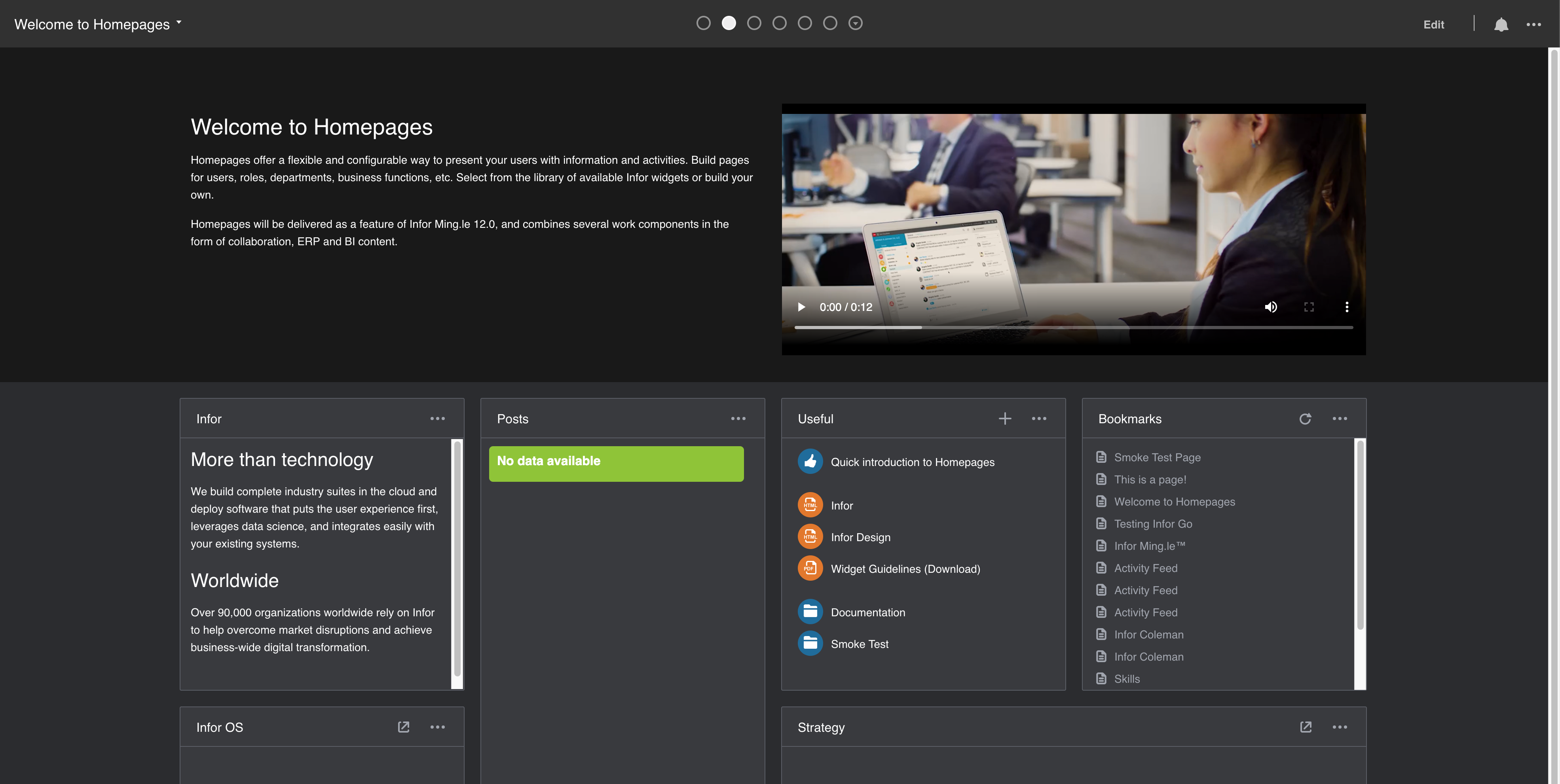
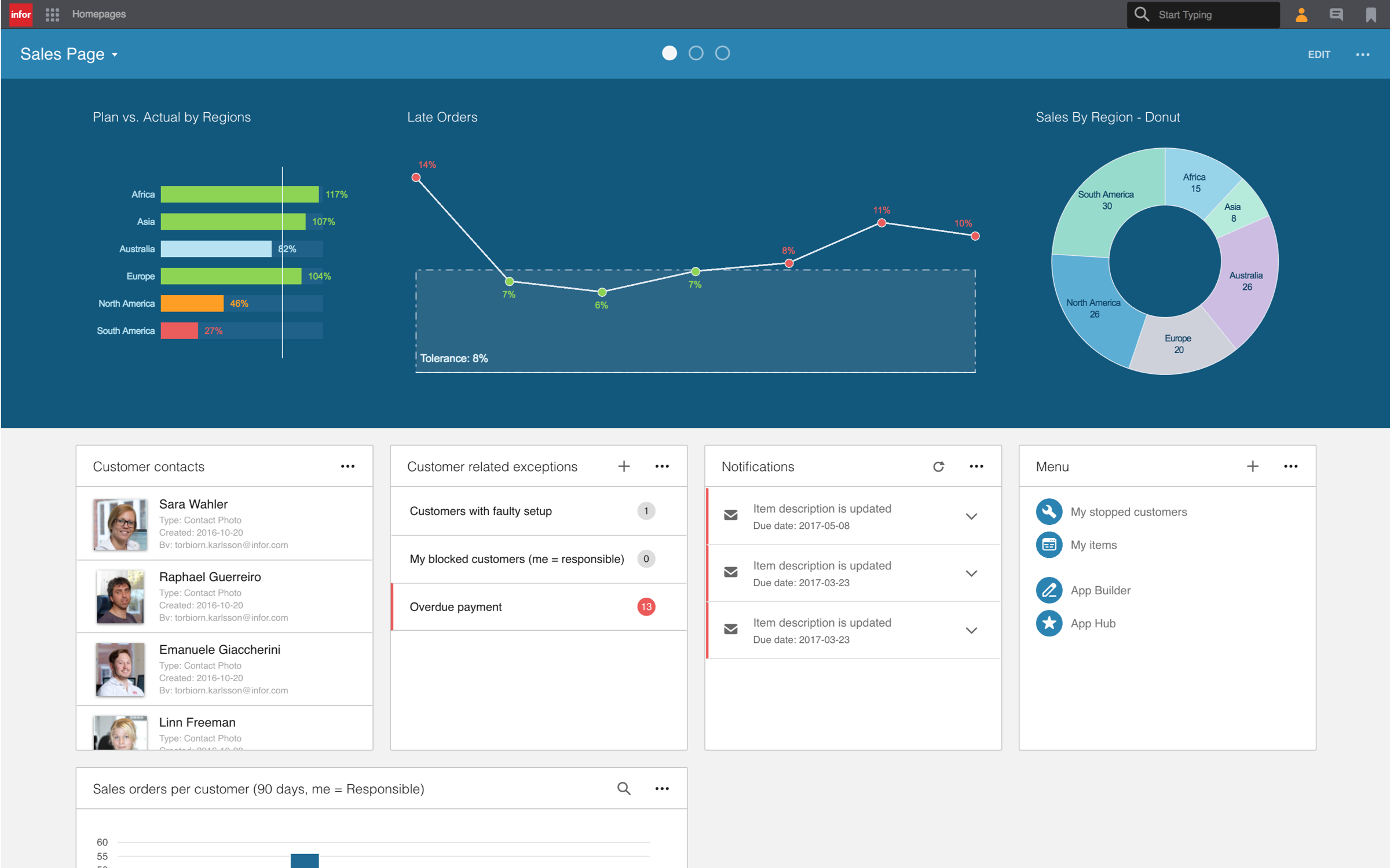
Design for all widget sizes
A widget can be used on a page in 8 different sizes (1x1, 1x2, 1x3, 1x4, 2x1, 2x2, 2x3 and 2x4). Your widget should be runnable in all of these, meaning that all components should be visible and usable.
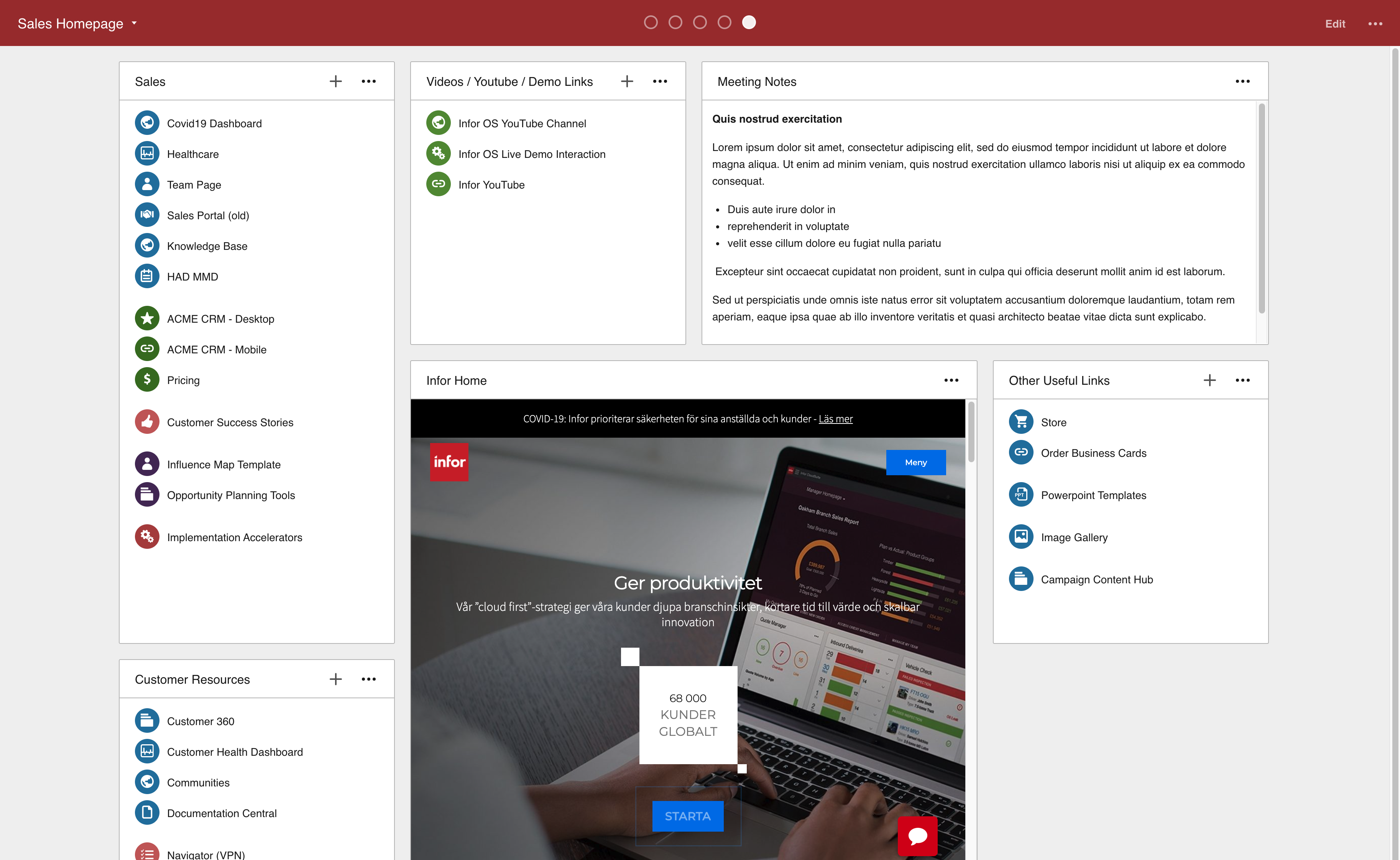
Consider optimizing your widget for all widget sizes, by for example showing additional content when the widget is larger than 1x1, or adjusting margins, paddings and/or graphic elements when the widget is smaller to make your widget more efficient.
Add widget screenshots
You can add up to three PNG image files that will be shown when viewing the widget in the Widget Catalog. The screenshots helps communicate the widget’s features and visual experience for your end users.
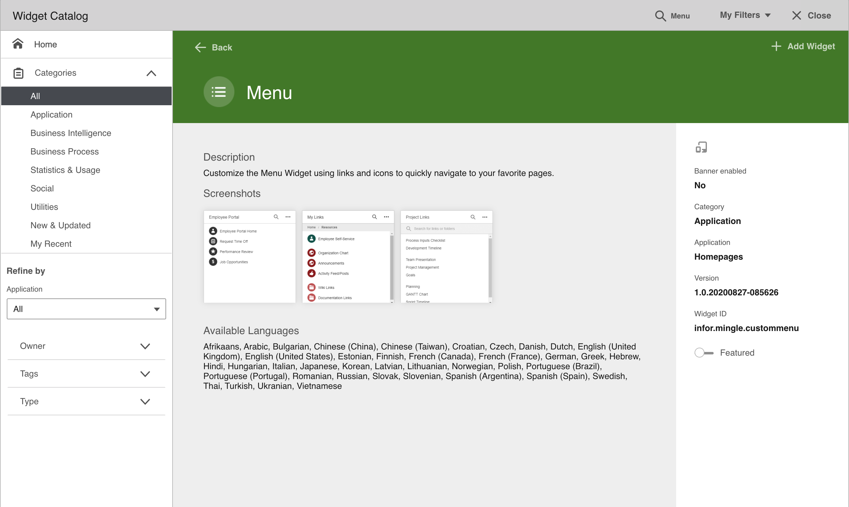
Configure your screenshots by adding up to three PNG image files in the widget ZIP.
The screenshots must be named screenshot1.png screenshot2.png etc. The image will be displayed in a 200x200px container, and if the image is clicked the image is shown in its original size.
Reference the images using the screenshots property in the widget manifest. The value should reflect the number of screenshots.
Example
"screenshots": "2"
Further reading
- Developer’s Guide (Chapter 3: Widgets > Widget manifest > Optional manifest properties > Screenshots for the widget catalog)
Enable your widgets for Infor Go
Allow your users to access your widget from the Infor Go mobile application for Android and IOS. When running on a mobile device the widget can access native device features like GPS information and camera.
Enable your widget for Infor Go by setting the target property in the widget manifest to mobile.
Example
"target": "mobile"
Further reading
- Developer’s Guide (Chapter 3: Widgets > Mobile Widget)
Build your widgets for the banner area
A Banner widget is a widget that can be added to the banner container. The banner container is located at the top of the page directly below the page header, and always spans the entire first row. It holds between one and four banner widgets and has a background color based on the color of the page.
Enable your widget for the banner area by setting the target property in the widget manifest to banner.
Example
"target": "banner"
Further reading
- Developer’s Guide (Chapter 3: Widgets > Banner Widget)
Configure a Help URL
Give your users some help along the way by providing a link to documentation for your widget. The link will be displayed for end users in the About dialog.
Configure the link by adding the helpUrl property in the widget manifest.
Examples
"helpUrl": "http://www.example.com/"
"helpUrl": "{Scheme}://{Hostname}:{Port}/{TenantId}/MyApp/Help"
"helpUrl": https://docs.infor.com/mingle/12.0.x/{Language|lower}/minceolh/default.html?helpcontent=jho1449259087119.html
The last example would equate to the following url when english is set as the language:
https://docs.infor.com/mingle/12.0.x/en-us/minceolh/default.html?helpcontent=jho1449259087119.html
Further reading
- Developer’s Guide (Chapter 3: Widgets > Widget manifest > Optional manifest properties > Help URL)